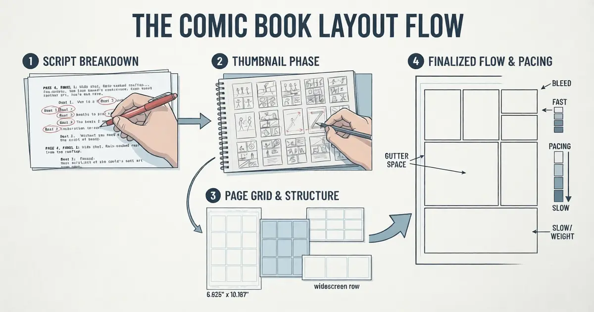
Comic book layout structure is one of those things nobody notices until it goes wrong. You’ve felt it. You’re reading an issue, everything’s humming along, and then suddenly you’re staring at a page thinking… wait, which panel comes next? You read the balloon on the right before the one on the left. Now the joke makes no sense. The artist lost you — and once a reader is lost, half of them put the book down.
That moment right there is a layout failure. Not a drawing failure. The art might be gorgeous. The structure underneath it collapsed.
So let’s fix that. This guide walks through how to structure a comic book page the way working artists actually do it — script first, thumbnails second, grid third, polish last. No art degree required. And honestly, if you get to the end and decide you’d rather write while someone else handles the pages, that’s fine too. Our comic illustration services team at Drawphics does exactly this for indie creators and small publishers, mostly in the US. But learn the craft first. Even if you outsource, you’ll give better notes.
What Comic Book Layout Structure Actually Means
Strip away the jargon and comic book layout structure is just this: the arrangement of panels, gutters, and text on a page, organized so a reader always knows where to look next and how fast to go.
I like the house metaphor. Panels are rooms. Gutters are hallways. The reader is a guest wandering through, and your job is making sure they never open a door into a wall.
Every decent comic page layout design pulls off three jobs at the same time:
- It steers the eye. American readers move in a Z — left to right, drop down, left to right again. Fight that pattern without a reason and you’ll pay for it.
- It controls time. This one surprises beginners. A wide panel makes a moment linger. Six skinny panels in a row? That’s a machine gun. Layout is pacing in this medium.
- It carries feeling. A rigid grid reads as tension or control. A full-page splash reads as awe. The shape of the page talks before a single line of dialogue does.
Get those three working together and readers fly through your book without ever noticing why. Which is the whole point. Good layout is invisible.
Step 1: The Script Comes First — How to Write a Comic Script Into Panels
Everything starts as words on a page, and script to panel comic writing is where most first-timers faceplant. Usually because they try to stuff a whole scene into one panel.
Here’s the workflow I’d hand any beginner:
Break the story into pages before you even think about panels. What happens on page one? Page two? A trick worth stealing from the pros: try to end pages — especially the odd-numbered ones, the right-hand pages — on a little hook. Something that makes the hand turn the paper.
Then list your beats. A beat is a single moment. One punch. One reaction shot. One line landing. Most pages hold somewhere between three and seven beats before they start feeling stuffed.
Now the golden rule, and if you remember nothing else from this section remember this: one beat, one panel. That’s really the whole secret of how to write a comic script into panels. Two actions crammed into one frame reads as mud. Always.
Write your panel descriptions like a film director barking shots. Something like:
PAGE 4, PANEL 1: Wide shot. Rain-soaked rooftop, Chicago, night. MARA crouched at the ledge. PANEL 2: Tight on Mara’s eyes. MARA: “Found you.”
Each panel = one drawable instant. Also — keep dialogue under 25 or 30 words per panel. Past that, the balloons start eating the artwork alive, and no letterer on earth can save you.
Step 2: Thumbnails, or How to Plan Comic Book Layouts Without Wasting a Week
Do not — seriously, do not — go straight from script to finished pencils. You will redraw everything. Thumbnails exist to save you from yourself.
A thumbnail is a rough page sketch the size of a playing card. Stick figures, scribbled borders, arrows. Ugly on purpose. That ugliness is the point, because it’s cheap. Redrawing a thumbnail costs you ninety seconds. Redrawing a finished page costs you a Saturday.
When you’re figuring out how to plan comic book layouts at this stage, a few habits pay off fast:
Sketch two or three versions of every page. Your first layout idea is almost never the best one; it’s just the most obvious one. Trace the reading path with your fingertip — literal finger on paper. Anywhere your finger hesitates, a reader’s eye will hesitate too. And rough in your balloon positions now, not later. Text is part of the layout. Treating lettering as an afterthought is probably the single most common amateur mistake I see.
A comic book storyboard template helps a lot here — just a sheet of pre-drawn page rectangles at the right proportions. Standard US trim is 6.625″ × 10.187″, and working at the correct ratio from the start saves you from nasty cropping surprises at print time. Oh, and if your cast isn’t locked yet, sort that before layouts; our character design services exist for exactly that reason. Redesigning a hero on page 40 is misery.
Step 3: Pick a Grid — The Comic Book Grid Layout Question
Underneath nearly every professional page sits a grid. Even the wild experimental stuff usually starts from a comic book grid layout and then breaks it on purpose.
Your realistic options:
The 9-panel grid. Three by three. This is the Watchmen grid, and it’s a metronome — dense, steady, relentless. Brilliant for dialogue and dread. And because every panel is identical, the moment you break the pattern (one double-wide panel, say) it lands like a slap.
The 6-panel grid. The default of mainstream American comics for decades, and for good reason. Enough room for action, enough structure for clarity. If you’re torn, pick this one and move on.
The 4-panel grid. Big panels, bold storytelling. Kids’ comics love it. So do splashy action books.
Widescreen rows. Stacked horizontal panels, very cinematic, very moody. Slow by nature — don’t use it for a fistfight.
Whichever you choose, make it your book’s home base. Consistency isn’t boring; consistency is what makes your exceptions mean something. A splash page in a disciplined 9-grid book stops hearts. A splash page in a book that’s all splash pages is wallpaper.
Step 4: Comic Book Panel Arrangement — Making the Eye Behave
Grid chosen. Now the fun part, and the part where layout becomes actual storytelling: comic book panel arrangement.
The rules that matter most:
First panel top-left, last panel bottom-right. The Z-path is sacred in US comics — bend it only when confusion is the effect you want, which is basically never.
Size equals importance. The big moment gets the big panel. Transitions and connective tissue get small ones. Readers absorb this hierarchy without knowing it.
Inset panels — a small frame floating inside a bigger one — are wonderful for reactions. The hero mid-leap in the big frame, her terrified sidekick in a little box in the corner. Two beats, one composition, zero confusion.
Watch out for the trap layouts. A tall vertical panel sitting next to two stacked horizontals is the classic one: readers genuinely can’t tell whether to go down or across. If you must build a page like that, let the balloon placement drag the eye along the correct route.
And bleeds — panels running clean off the page edge — feel huge and cinematic. Ration them. Everything in visual storytelling in comics works on contrast; a tool used constantly stops being a tool.
Step 5: Respect the Gutter — Gutter Space in Comics
Weird truth about this medium: some of the most important storytelling happens in the empty strips between panels.
Gutter space in comics is where the reader does the work. Panel one, a fist swinging. Panel two, a villain on the floor. Nobody drew the impact — the reader’s brain supplied it, in the gutter. Scott McCloud called this “closure,” and it’s the engine the whole art form runs on.
Practical numbers, since people always ask: on a printed US page, gutters usually sit around 1/8″ to 1/4″, and the key word is consistent. Once your standard gutter is steady, deviations become vocabulary. Wider gap? Time is passing, or the scene is changing. No gap at all — panels slammed together or overlapping? Chaos, panic, a brawl. Some artists also cut their horizontal gutters slightly thicker than the vertical ones, which quietly nudges the eye to finish each row before dropping down. Subtle. Effective. Free.
Step 6: Comic Panel Pacing and Flow
Pacing in comics is rhythm you can see, and comic panel pacing and flow is the dial you turn to control it.
Want speed? More panels, narrower panels, tighter shots. A row of thin close-ups reads like a drum fill.
Want weight? Fewer panels, wider panels — and silence. A wordless wide panel is a held breath, and it’s criminally underused by new creators who feel obligated to fill every frame with chatter. Some of the best pages in comics have no dialogue at all.
Want a gut-punch? Shrink your panels as you approach a page turn, tighten the screws… then hit them with a full splash on the other side. The page turn is the drumroll built into the physical object. Print comics get this for free; use it.
My favorite test: read the finished layout out loud, beat by beat, and listen. If your voice’s rhythm and the panels’ rhythm disagree — fix the panels. The script already knows what it wants.
Step 7: Test It Before You Ink It
Last stretch. Before any finished art:
Print your thumbnails at full size and read them cold, like a customer would. Flaws that hid at thumbnail scale get loud at 10 inches tall. Then hand the pages to someone who’s never seen the story. If they read a single panel out of order — not their fault. Fix the page.
Check your lettering room too; a dialogue panel needs roughly a quarter to a third of its space free for balloons. Confirm bleed and margins against your printer’s spec sheet (0.125″ past trim is the usual US standard). Then lock the layout and only then start drawing. Restructuring panels after finished art is the most expensive mistake in comics production.
This is also the natural handoff point if you’re bringing in an artist. If you’ve got a locked script and want print-ready pages, reach out to our team — or poke through our portfolio first to see the comic pages, 2D illustration work, and digital concept art we’ve shipped for clients across the States.
Mistakes I See Constantly
A short hall of shame, because it’s faster to learn from other people’s wrecks:
- Nine, ten, eleven panels on a page. Past seven or eight, everything suffocates.
- Blowing the reveal on a left-hand page. Readers see both pages of a spread at once. Your shock twist on the verso is a twist nobody experiences. Big surprises go after the page turn, always.
- Jagged panels for no reason. Tilted, shattered borders signal chaos and energy. Slapping them on a quiet kitchen conversation is like scoring a nap with an air horn.
- Gutters that wander. Random spacing changes make readers seasick without knowing why.
- Designing panels before pages. The page is the unit of composition. Panels are just notes; the page is the song.
Wrapping Up
Here’s the thing about comic book layout structure — it sounds restrictive until you actually use it, and then it feels like a superpower. The grid, the gutter math, the Z-path, the pacing tricks: none of it exists to box you in. It exists to keep a stranger inside your story from panel one to the final page. Learn the rules cold, break them on purpose, and your pages will read like they drew themselves.
And if you’d rather stay on the writing side of the desk, Drawphics handles the visual half — full illustration services, from comics and book cover designs to complete custom book illustration projects. Either way: structure first, style second. Your readers will thank you without ever knowing what they’re thanking you for.
Frequently Asked Questions (FAQs)
1. What is comic book layout structure?
It’s how panels, gutters, and text are arranged on a page to control reading order, pacing, and emotion. Solid layout keeps readers oriented so the art and story can do their job.
2. How many panels should a comic book page have?
Most US pages run 3 to 7 panels. Fewer panels slow moments down for drama; more panels quicken the pace. Past 8, pages get cramped and readers tire fast.
3. What is gutter space in comics?
The gutter is the gap between panels. Readers mentally bridge it, imagining what happens between frames — a process called closure, and the core trick behind all comics.
4. Which comic grid layout is best for beginners?
Start with the 6-panel grid (2×3). It’s the American industry workhorse — roomy enough for action, structured enough that reading flow basically takes care of itself.
5. How do I turn a comic script into panels?
Split each page into single beats, give every beat its own panel, then thumbnail the page to test flow. Cap dialogue near 30 words per panel so lettering fits cleanly.