I’ve sat in on a lot of founder calls this year, and the same question keeps coming up in one form or another: “does our logo actually matter right now, or should we just focus on the product?” Fair question. But here’s the thing — graphic design trends for startups aren’t a nice-to-have anymore. They’re part of how a customer in the U.S. decides, in about three seconds, whether your company is worth trusting.
2026 has a different visual mood than the last few years. The clean, gradient-heavy, almost robotic look that every SaaS company copied from every other SaaS company is fading. What’s replacing it feels rougher, more personal, sometimes a little unpolished on purpose. Below is what I’m actually seeing work for startups right now — not just what’s trending on design Twitter.
Why This Actually Matters for a Startup’s Growth
Let’s get the skeptical question out of the way first: does design move revenue for a startup running on a shoestring budget?
Yes. Not in a vague, feel-good way — in a specific one. Here’s how graphic design impacts startup growth in practice:
Your visuals are usually the first thing a customer, journalist, or investor sees, and they form an opinion before reading a word of your pitch. A consistent look across your app, website, and Instagram makes people remember you and — this part gets underrated — makes it easier for them to describe you to someone else. Design also just signals competence. Fair or not, a rough-looking landing page makes people question whether the product behind it is rough too.
So if you’re weighing design against, say, another engineering hire, know that you’re not choosing between “growth” and “polish.” Design is part of growth.
The Graphic Design Trends Startups Are Actually Using in 2026
1. A Real Visual Identity, Not Just a Logo File
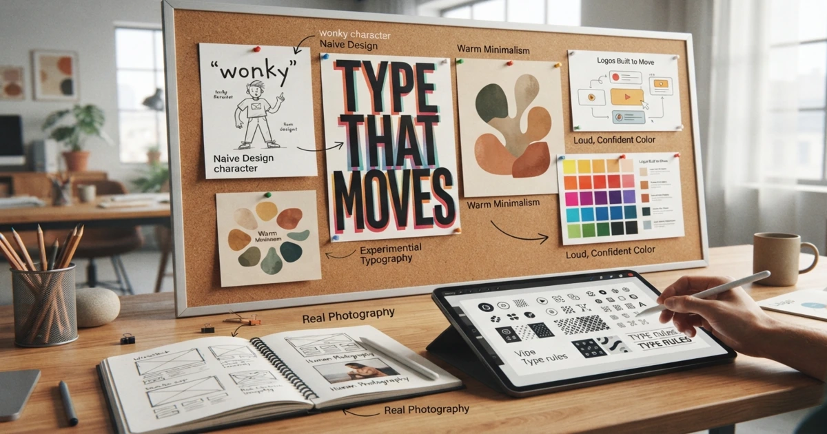
A few years back, most founders asked us for “just a logo.” Now they’re asking for something bigger — a proper startup visual identity: logo, type, color, icon style, even photography direction, all built to hold together whether it’s on a pitch deck or a 15-second TikTok ad.
If you’re starting from zero, this is basically what our graphics branding work is built around — one system that doesn’t fall apart the moment you use it somewhere new.
2. Naive Design Is Having a Moment
This one surprised a few of our clients when we first suggested it. So — what is naive design in branding? It’s the deliberately simple, hand-drawn, slightly wonky style. Imperfect line art, flat little characters, shapes that don’t line up perfectly on purpose.
It’s catching on because it feels made by a person, not spat out by an agency template. We’ve used it a lot for food brands, wellness apps, anything that wants to feel like a friend instead of a corporation. It won’t suit every startup — a payments app probably shouldn’t look like a children’s book — but for the right brand, it does more than a “professional” logo ever could.
3. Typography Doing the Heavy Lifting
Type used to be an afterthought. Not anymore. Experimental typography for startup logos — oversized letters, weird ligatures, mixed weights, type that moves — is quietly replacing the same three sans-serif fonts every startup logo seemed to use in 2022.
There’s a practical upside too: a strong typographic mark is usually cheaper to animate and easier to adapt across formats than a detailed illustrated logo. Good for founders watching every dollar.
4. Human-Centric Design, Because People Are Tired of Fake
Here’s why startups need human-centric design right now, bluntly: people can smell AI-generated visuals a mile away, and a lot of them are sick of it. Human-centric design means real hand lettering, real photography, an actual point of view — not just efficient production.
That doesn’t mean throwing out helpful tools. It means using them to support a human story instead of replacing it. The startups earning trust right now are the ones that still feel like they were made by someone, not something.
5. Warm Minimalism Instead of Cold Minimalism
Flat, sterile minimalism is softening up. Think grain, texture, muted earthy tones, rounded organic shapes — still simple, just less clinical. It reads as inviting rather than empty.
6. Logos Built to Move
Nobody’s meeting your brand on a printed business card first anymore — it’s a phone screen. So logos and identity systems are increasingly designed with motion in mind from day one: app splash animations, quick social intros, that sort of thing. If that’s on your radar, our 2D & 3D animation services are usually the next step once the identity itself is locked.
7. Loud, Confident Color
After a long stretch of muted pastels, a lot of U.S. startups are going bold again — saturated, high-contrast color pairings that actually stop the scroll. Pairs well with the naive design and typography trends above.
8. Photography and Illustration That Doesn’t Look Rented
Stock photos are losing their grip. Custom illustration and slightly imperfect, real photography are winning because they’re specific to one brand — not something a competitor could screenshot and use tomorrow.
Creative Design for New Businesses: Where to Actually Start
If you’re a founder trying to turn any of this into a real brand, don’t chase every trend at once — that’s how you end up with a mess. A few things that actually help:
Pick one or two trends that fit your audience, not whatever’s popular this week. A fintech app leaning into naive design is going to confuse people; a kids’ product probably needs it. Build the system before you build the assets — lock in colors, type, and logo rules first, then let marketing graphics follow from that. Keep it flexible enough to work on a business card and a billboard without a redesign, and write it all down somewhere. A one-page brand guide sounds unnecessary until your team grows past three people and everyone’s Canva version looks slightly different.
Branding and Logo Design for Startups: A Few Things That Never Go Out of Style
No matter which trend you pick, some fundamentals hold up regardless of the year. Design your logo so it still reads clearly in plain black and white before you even think about color. Test it at app-icon size — that’s genuinely how most people will see it first. Be careful with trend elements that are so specific they’ll look dated in eighteen months; use them as accents, not the whole identity. Make sure your fonts are properly licensed for commercial use, and keep your palette tight — two or three core colors, one accent, done.
Quick Recap: Essential Graphic Design Trends for Startups
| Trend | Works Best For |
| Naive design | Consumer, wellness, food & beverage brands |
| Experimental typography | Tech, media, DTC startups |
| Human-centric design | Any brand competing with AI-made content |
| Warm minimalism | SaaS, professional services |
| Motion-first branding | Mobile apps, social-first brands |
| Bold color | Early-stage brands that need to be remembered fast |
Where Drawphics Fits In
We work with early-stage founders across the U.S. who want a brand that actually fits their business, not just whatever’s trending this quarter. That might mean a full graphic design package, custom illustration work, or ongoing social media graphics that keep everything consistent as you grow.
Have a look through our portfolio if you want to see how this plays out in practice, or just get in touch and tell us where you’re stuck.
Final Thought
If there’s one thread running through all these graphic design trends for startups in 2026, it’s this: people want brands that feel like they were made by someone, not manufactured by a template. You don’t need a huge budget for that — you need a clear identity, used consistently, that actually reflects who you are.
Want more of this kind of thing? Browse the rest of our blog, or reach out and we’ll talk through your brand directly.
Frequently Asked Questions
1. What are the biggest graphic design trends for startups in 2026?
Naive design, experimental typography, human-centric visuals, warm minimalism, and motion-first branding are leading for U.S. startups this year.
2. What is naive design in branding?
It’s a deliberately simple, hand-drawn, slightly imperfect style that feels made by a person rather than a polished agency.
3. Why do startups need human-centric design?
Because audiences are tired of generic AI-made visuals and trust brands that feel genuinely made by real people.
4. How does graphic design impact startup growth?
Good design builds trust, boosts recall, and helps you stand out — all of which quietly influence conversions and investor confidence.
5. How much should a startup spend on branding and logo design?
It varies a lot, but a flexible identity built early saves money later by avoiding constant redesigns and inconsistent marketing.