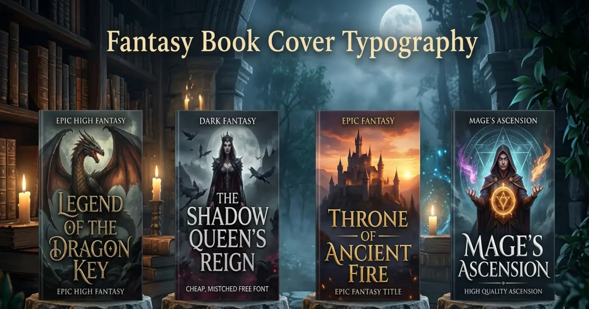
Nobody warns new fantasy authors about this until they’ve already made the mistake: readers judge your book cover typography before they read a single line of your blurb. You could have a gorgeous painted dragon circling a castle, a color palette an editor fussed over for weeks, a title that took you three drafts to land on. Doesn’t matter. If the font is wrong, the whole cover reads wrong, and most readers won’t stick around long enough to figure out why.
Here’s the pattern I keep seeing. Authors pour weeks into the illustration, then slap a font on at the very end almost like an afterthought — something to fill space above the artwork. But fantasy book cover typography isn’t decoration sitting on top of the picture. It’s doing half the selling, and it does it fastest on a two-inch Amazon thumbnail, not the full-size cover you’re proud of on your desk. Below are the seven typography mistakes that show up again and again on self-published fantasy covers, plus what actually fixes them.
1. Picking a Font That Doesn’t Match the Subgenre
“Fantasy” isn’t one genre. It’s more like a dozen genres wearing the same trench coat. Grimdark, cozy fantasy romance, epic high fantasy, YA portal fantasy — each has its own visual grammar, and a font that works for one will actively work against another. A lot of self-published covers skip this step entirely and just grab whatever font “looks fantasy” from a free pack, without checking if it fits the actual subgenre on the page.
Get this wrong and you’re sending the wrong signal before a single word gets read. Splash a jagged, blood-spatter font across a lighthearted fae romance and readers will assume horror and click away. Put a soft, curly script on a brutal war epic and you’ve undersold your own stakes. Readers use type the way they use book covers in general — as a shortcut. Lie to that shortcut and they stop trusting the rest of the cover too.
The fix is almost annoyingly simple: pull up 15-20 bestsellers in your exact subgenre before you touch a font file. Don’t just look at what the letters look like — notice what feeling they’re going for.
2. Defaulting to Generic Free Fonts for Fantasy Titles
There’s a very specific look to “I found this in a free font bundle five minutes ago,” and it shows up on fantasy covers constantly. Using generic free fonts for fantasy titles is probably the fastest way to make a self-published book look self-published in the bad sense of that word.
To be clear, free fonts aren’t the villain here. Plenty are well made. The problem is repetition. When the same three or four “medieval-ish” fonts show up on thousands of Amazon covers, readers’ brains file them under “template,” not “story.” Familiarity that used to signal genre now just signals mass-produced.
If budget allows, license something or work with a designer who has access to a real type library. If it doesn’t, at least customize the spacing, weight, and layering enough that it stops looking like the out-of-the-box default.
3. Cramming Too Much Title Text Onto One Cover
This one usually starts innocently — a subtitle here, a series name there, a tagline the author really wants readers to see, plus the author name itself. Overcrowding a cover with title text is what happens when nobody sets a hierarchy. Every element fights for the same attention, so readers’ eyes skim past all of it instead of landing anywhere.
A cover that works has exactly one clear focal point, usually the title itself, with everything else quietly supporting it in the background. Five different text elements shouting at the same volume means none of them get heard.
Rank things by importance before you lay anything out. Title first. Series name second. Author name third. Tagline last, or honestly, just cut it. Give your top priority the visual weight and let the rest fade back.
4. Stacking Too Many Decorative Fonts Together
One bold display font can absolutely carry a cover on its own. Three or four decorative styles competing at once cannot. Too many decorative fonts on a single book cover is one of those book cover design mistakes that looks fine at 100% zoom on a designer’s monitor and completely falls apart the second it shrinks.
Every extra novelty typeface adds friction. A reader’s brain has to work to figure out what it’s even looking at, and in a marketplace where people scroll past hundreds of covers a minute, nobody’s going to put in that effort for an author they’ve never heard of.
Stick to one display font for the title and one clean, quiet font for everything secondary — author name, series info, that’s it. That’s fantasy font pairing done properly: contrast, not chaos.
5. Ignoring Font Legibility and Contrast Against the Art
An ornate, beautifully carved typeface is worthless if nobody can read it. This is where font legibility and contrast quietly wrecks otherwise strong covers. Thin serifs disappear into busy illustrated skies. Pale gold lettering vanishes against a similarly pale background. Delicate flourishes turn into visual mush at anything under full screen size.
Poor text contrast on dark backgrounds is an especially common flavor of this mistake. Fantasy loves moody palettes — night skies, shadowed forests, dragon scales — and it’s easy to pick a title color that matches the mood without ever checking whether it actually stands out against it.
Test the title against the real background, not a flat color swatch on your screen. If you have to squint even a little on a phone, it needs stronger contrast, a subtle outline, or a different spot on the cover entirely.
6. Getting Book Title Font Sizing Wrong
Book title font sizing is a balancing act, and most first-timers lean too hard one way or the other. Either the title’s so oversized it swallows the artwork whole, or it’s so small and dainty it gets lost in a busy fantasy illustration.
Sizing has to work in two completely different environments at once: a large print cover on a bookstore shelf and a two-inch-wide thumbnail on a phone screen, where most readers will actually meet your book for the first time.
Aim for a title that fills a confident chunk of the top or bottom third — big enough to anchor the whole design, not so big it crowds out the art underneath. Then check it against the test in the next section before you call it finished.
7. Skipping the Amazon Thumbnail Test — and Bad Kerning
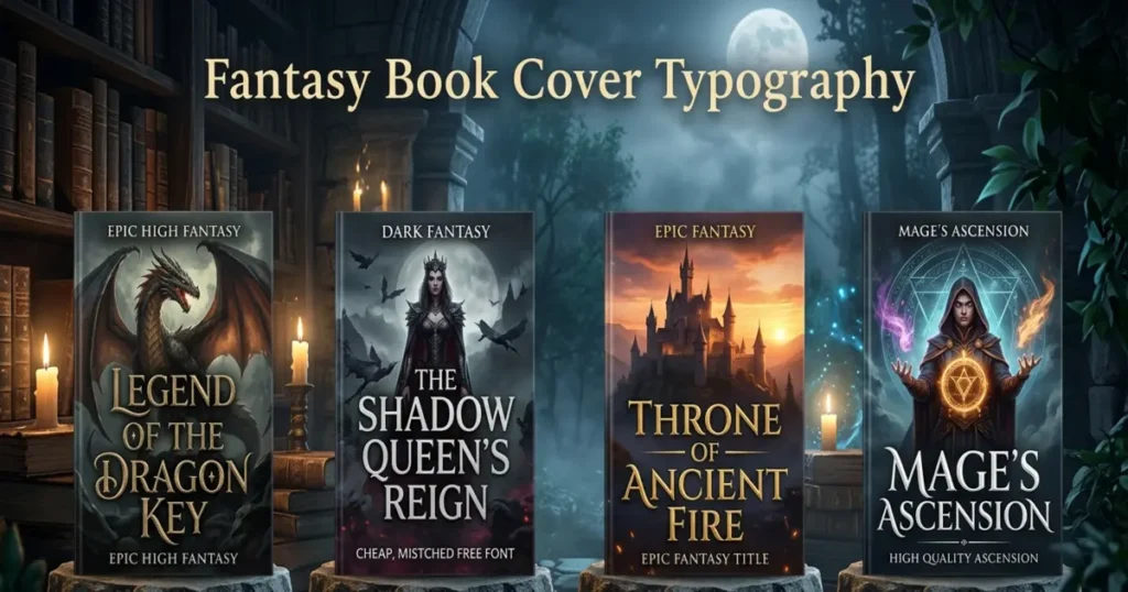
This last one ties everything above together. Your fantasy novel doesn’t sell mainly off a big printed cover sitting on a table. It sells off a tiny thumbnail buried in a search results page, a “customers also bought” row, a scroll of a hundred other covers competing for the same half-second of attention. If your title hasn’t passed the Amazon thumbnail test, you genuinely have no idea whether it works.
Unreadable fonts at thumbnail size are far more common than you’d expect, even on covers that look sharp at full resolution. Fine serifs blur into gray fuzz. Ornate details smear into an unreadable smudge. Bad kerning and letter spacing — letters jammed together or drifting too far apart — becomes obvious once there’s less detail elsewhere to hide behind.
Shrink your cover down to roughly 300 pixels wide, which is close to Amazon’s thumbnail size, and look at it on your actual phone. If the title turns into a blur at that size, it needs a bolder weight, tighter spacing, or better contrast. There’s no version of “it’ll be fine at full size” that saves you here — thumbnail size is where the sale actually happens.
Why Typography Deserves the Same Attention as the Art
Professional fantasy book cover design treats type and illustration as one system, decided together, not two separate jobs handed off at different stages. Font choice, the artwork’s color palette, layout, and thumbnail performance all need to be worked out from the start — which is genuinely hard to do alone when you’re also juggling drafting, editing, and marketing.
That’s the gap a professional book cover design service is meant to close — pairing artwork with typography that’s actually been checked for legibility, subgenre fit, and thumbnail performance before it goes live. For fantasy specifically, where the illustration usually carries a lot of visual detail, working with an illustrator who specializes in book cover art means the type gets designed around the art, instead of dropped on top of it after the fact.
Want to see what that looks like in practice? Our portfolio has fantasy and genre fiction covers where the typography and illustration were built together from day one. And if you’re ready to talk through your own cover, the quickest way to start is to just reach out to our design team with your manuscript and subgenre.
Final Thoughts
Fantasy book cover typography isn’t a finishing touch you slap on at the end — it’s a big part of whether a reader even gives your book a chance in the first place. The seven mistakes above (wrong subgenre fonts, generic free fonts, overcrowded text, clashing decorative fonts, weak contrast, bad sizing, skipping the thumbnail test) are all fixable, and usually without touching the illustration at all. Fix the type and the same cover that was getting scrolled past starts earning clicks instead.
If self-published cover design has started feeling like more trial and error than you have time for, it’s worth looking into hiring a fantasy book cover designer who already knows how these fonts hold up across print, ebook, and thumbnail sizes — before your next launch date sneaks up on you.
Frequently Asked Questions
1. What’s the biggest typography mistake on fantasy book covers?
Choosing a font that doesn’t match the subgenre. It sets the wrong tone before readers even see the illustration or blurb.
2. How do I know if my book cover font is readable enough?
Shrink the cover to about 300 pixels wide and view it on a phone. If the title blurs, it needs bolder weight or contrast.
3. How many fonts should a fantasy book cover use?
Usually two: one bold display font for the title, one clean font for the author name and series info.
4. Why does the Amazon thumbnail test matter so much?
Most readers first see your cover as a tiny thumbnail, not full-size. If type fails there, it fails where it counts most.
5. Should I use free fonts for a fantasy book cover?
You can, but customize spacing and effects first. Overused default fonts often make a cover look template-made.