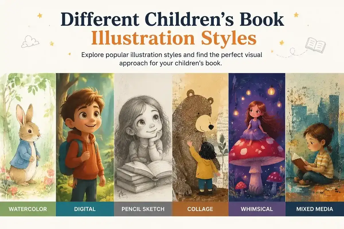
I see it all the time. An author finds an artist they love. The portfolio is stunning. The contract is signed. Months later the art comes back. Not badly drawn. Just wrong for the story.
One author I worked with paired a dark, moody style with a fun bedtime look. Another cartoon-bouncy effect went wrong for a quiet, reflective story. Both require the restarting work. Both lost time and money they didnt have to.
Here’s the problem: beautiful art does not always mean the right art.
Here’s the solution: know your style before you brief an illustrator.
This guide walks through the main children’s book illustration styles, what each one is actually good at, and how to match one to your story before you brief an illustrator.
What “Illustration Style” Actually Means
Authors mix up two different words constantly. It messes up the task and creates confusion.
Style: the visual vibe, cartoon, realistic, whimsical, etc. It’s about how a scene gets interpreted: exaggerated or true-to-life, bright or muted, playful or grounded.
Medium: the actual physical or digital. Watercolor, acrylic, pencil, collage, digital painting, those are mediums. A single style can show up in more than one medium. A whimsical scene painted in watercolor and a whimsical scene built entirely in Photoshop will both read as whimsical. Just with different texture.
Here’s why this matters: when authors say “I want a watercolor style,” they’re usually describing a medium, not a style category. Know the difference before you start looking at portfolios or briefing anyone.
The Main Children’s Book Illustration Styles
These are the styles that show up most often across children’s picture books published in the US market right now.
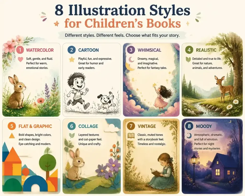
Cartoon and Line Illustration
Cartoon illustration: simple shape, big expressions, bright flat colors. Proportions don’t have to match reality. A character’s eyes can be twice the size they should be if it helps the emotion land. That flexibility is why cartoons are one of the most common styles in children’s publishing.
Line illustration: Clean, confident linework, often black and white or with limited color, ranging from loose and sketchy to precise and controlled.
Mo Willems’ Elephant and Piggie books are great examples. Hand-drawn black and white lines, finished with digital color later. Rules keep the simplicity clear. It helps young readers focus smoothly on the characters’ expression and what they are saying.
It meets the main intent of the reader, as now the focus is wholly on the character, not on the background.
Cartoon and line styles tend to work well for playful, character-driven stories and books aimed for younger readers.
Watercolor Illustration
Watercolor: uses transparent, water-based pigments applied in layers. Colors blend softly at the edges, creating soft gradients instead of hard lines. Because the paint is translucent, light passes through it in a way that gives watercolor its signature glow, soft, warm, and almost magical.
Beatrix Potter’s The Tale of Peter Rabbit is one of the earliest watercolor classics. That style has been tied to children’s picture books ever since.
One practical thing, though: watercolor is harder to adjust after the fact than digital work. Need a significant change to a scene? It often has to be repainted rather than tweaked. Getting the brief right early matters more here than with digital styles.
Whimsical and Fantasy Illustration
Whimsical illustration: imagination over reality. Proportions bend. Environments feel dreamlike. Colors skew toward pastels or saturated ones. The goal isn’t representing realism; it’s making the reader feel like anything could happen.
Dr. Seuss is probably the most recognized name tied to this exaggerated, imaginative visual world, where architecture, creatures, and landscapes all bend to serve the story’s sense of play.
Fairy tales, bedtime stories, and books built around magical or invented worlds, this style tends to suit all of them, particularly for younger readers who respond well to a strong sense of wonder.
Realistic and Semi-Realistic Illustration
Realistic illustration: accurate proportions, lighting, detail. In children’s books, it’s rarely fully photographic; most artists soften it, keeping real-world accuracy while leaving room for warmth and expression.
Realistic works best for non-fiction, historical fiction, and serious stories. Facts matter here. Emotional connection feels real. No imagination, no play.
Flat Digital and Graphic Illustration
Flat digital illustration: clean shapes, solid colors, little to no shading or gradient. It borrows from mid-century design and modern vector art, and it’s built almost entirely in digital software rather than traditional media.
The appeal is practical as much as visual. Flat digital files scale cleanly, are easier to adjust after a first draft, and hold up well across formats, print, e-book, or adapted for other uses later. Honestly, that’s a huge part of why it’s one of the more common styles in newer self-published picture books. The files are just more workable for revisions.
Collage and Mixed Media Illustration
Collage illustration: layered materials, not a single continuous drawing. Paper, fabric, photo scraps, and painted textures combined together, sometimes alongside traditional drawing or painting.
Eric Carle’s The Very Hungry Caterpillar is the clearest example most people already know. Carle hand-painted sheets of tissue paper with acrylic paint, then cut and layered them by hand to build each illustration, giving the finished art a textured, almost tactile quality a flat drawing can’t easily replicate.
Stories that benefit from texture and a slightly handmade feel — that’s the sweet spot for mixed media and collage, and it generally works across a wide age range since the visual interest comes from texture rather than complexity.
Vintage Illustration
Vintage style: borrows the visual language of earlier decades. Muted, warm color palettes; simpler shapes; and materials like pencil or ink, all of it gives the art an intentionally older feel, even when the story itself is brand new.
Nostalgia, tradition, and timeless quality vintage works well wherever a story leans on those, and it’s a common choice for fairy tales.
Moody and Muted Illustration
Moody illustration: desaturated colors, soft shadows, and low contrast. Build atmosphere than energy. Where cartoon and flat digital styles grab attention quickly, moody illustration takes its time, using light and shadow to carry emotion.
Complex feelings, quiet emotional moments, a touch of mystery, this style tends to suit all of it, and it generally reads better with slightly older picture book readers who can sit with a subtler tone.
A Few Less Common Styles Worth Knowing
Manga-influenced art, abstract illustration, and densely detailed “seek and find” illustration (sometimes called Wimmelbuch style) , are not as widespread as the styles above, but none of them are wrong choices either.
Manga-influenced art shows up in graphic novels and books aimed at older children.
Abstract illustration, built from shape and color rather than recognizable forms, shows up in books meant to spark open-ended interpretation.
The Wimmelbuch style is common in books built around exploration rather than a single narrative thread. Just good to know these exist before assuming your book has to fit one of the styles above.
Matching a Style to Your Story and Age Group
Story mood is the starting point for picture book illustration styles, but age group changes what actually works on the page. Older readers can handle more detail and subtler emotional cues.
| Style | Typical age fit | Mood it tends to support | Production notes |
| Cartoon / Line | All ages, especially 3-8 | Playful, energetic, funny | Fast to produce, easy to keep consistent |
| Watercolor | 4-7 | Gentle, nostalgic, emotional | Slower, harder to revise after the fact |
| Whimsical / Fantasy | 3-7 | Magical, dreamy, imaginative | Works in both traditional and digital media |
| Realistic / Semi-Realistic | 6-10, nonfiction any age | Grounded, educational, serious | Needs a skilled artist to stay warm, not stiff |
| Flat Digital | All ages | Bold, clear, fast-paced | Easiest to revise and reformat |
| Collage / Mixed Media | All ages | Tactile, textured, handmade | Time-intensive, distinctive results |
| Vintage | 4-8 | Nostalgic, traditional, timeless | Works in pencil, ink, or digital emulation |
| Moody / Muted | 6-10 | Quiet, atmospheric, reflective | Best for slower-paced stories |
None of these age ranges are strict rules. They reflect general tendencies, not requirements. A skilled illustrator can push most styles outside their usual range if the story calls for it.
Why Style Consistency Matters Across a Full Book
Most style comparisons stop at a single sample image and do not explain well. A style that looks stunning as one illustration doesn’t automatically hold up across 24 to 32 pages of a full picture book. Here’s why;
Watercolor and collage are risky: they are beautiful, but they take a lot of time per page. A character’s face, expression, or color can shift slightly from page to page if the artist is not extra careful.
Not the Artist’s fault: it’s much harder to repeat those techniques perfectly 32 times. Its about the medium, not the skill.
Safe option, digital or cartoon: you build the character once, then reuse and adjust them. No redrawing. Super consistent flow throughout.
How to fix: ask about consistency before hiring any illustrator. A character’s design will pass through early locks in your character’s looks. The character consistency must meet the same look flow on all pages.
How to Describe Your Style to an Illustrator
A vague brief leads to vague results. Use this checklist before you brief anyone:
Show Reference Images: Find 2-3 visual illustration artworks that you love the most. Point out exactly what you want. The colors, the character expressions, the background, the gradients.
Create a simple mood board (Pinterest or Google slides) and share the link.
Name comparable books: name 1-2 books that feel closer to your story projects. Something closer to Elephant and Piggie than Peter Rabbit says more than a whole paragraph of adjectives.
Mix moods with your style words: choose different moods with style words according to the demand.
Pick 2 style words (watercolour, cartoon, flat etc).
Pick 2 mood words (playful, calm, mysterious etc).
Combine them: a calm watercolor or a playful cartoon.
Know your reader: pointing out direction helps in clarifying the descriptive tone rather than to choosing random patterns. Saving your time by sending examples of what you dont like and be specific in instruction, like “No Dark colors,” “Not too realistic” etc.
Mention age group: that one detail shapes everything; detail level, color, choices, and expression. Specific in detailing, 3-5 year olds are better than young children.
FAQs
1. Can I mix illustration styles in one children’s book?
You can, but it’s uncommon and risky without a clear reason. Most picture books stay in one consistent style. Kids notice when something feels off.
2. What illustration style is most common in self-published children’s books right now?
Flat, digital, and cartoon, mostly because they’re faster to produce, easier to revise, and simpler to format for print and e-book.
3. Does my illustration style choice affect cost?
Absolutely. Detailed watercolor or hand-cut collage costs more than flat digital work because of the time each page takes.
4. Should I pick a style before hiring an illustrator?
Before, even a rough direction helps you find the right person. It narrows your search to illustrators who actually work in that style.
5. Do illustration style requirements differ for Amazon KDP books specifically?
The style itself isn’t restricted, but file resolution, color mode, and trim size do matter for KDP.
Conclusion:
If you’ve settled on a direction and want to see it applied to your own story, Drawphics works across most of the styles covered here, from watercolor to flat digital, and can help you take that decision from a mood board to a finished book.