Book cover design decides your book’s fate before anyone reads a single page. Harsh, but true. A shopper on Amazon gives your thumbnail maybe two seconds. Blink and it’s over. In that tiny window, the front cover of a book has to say “hey, this one’s for you” loud enough to stop a thumb mid-scroll.
I’ve watched authors spend three years polishing a manuscript, then slap together a cover in Canva on a Sunday afternoon. Then they wonder why nobody’s buying. It’s not the writing. Nobody ever got far enough to judge the writing.
So let’s fix that. This guide covers everything: genre rules, fonts, colors, layouts, ebook quirks, and the honest answer to when you should just hire a book cover designer and be done with it.
What Makes a Good Book Cover?
People overcomplicate this question. Strip away the design-school jargon and what makes a good book cover boils down to three things.
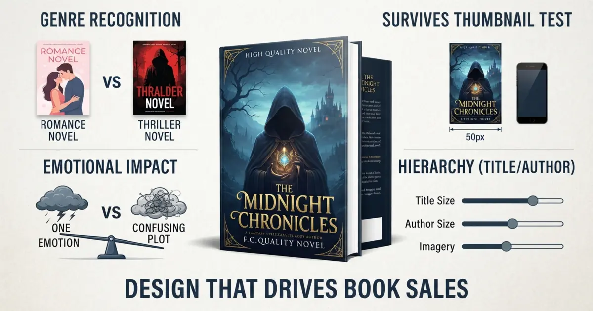
First, genre recognition. A reader should know it’s a thriller, or a romance, or a memoir, from across a Barnes & Noble. Not after squinting. Instantly.
Second, it has to survive being shrunk to the size of a postage stamp. That’s how most Americans meet your book now, as a tiny rectangle on a phone. If your title turns to soup at that size, you’ve lost.
Third, one emotion. Just one. Dread, longing, curiosity, whatever fits the book. Covers that try to cram in the whole plot end up feeling like a garage sale.
That’s it. Notice “shows the main character accurately” didn’t make the list. Your cover isn’t a book report. It’s a promise about how the book will make someone feel.
Why Professional Book Cover Design Actually Pays Off
Run the numbers with me for a second. Say your book sells for $4.99 on KDP. You pocket around $3.50 per copy. Professional book cover design might cost you a few hundred bucks. So the cover pays for itself after roughly a hundred extra sales, spread over the entire life of the book. That’s nothing. Authors who rebrand a weak cover routinely see their click-through rate jump, sometimes double, and those extra clicks compound month after month.
There’s also the trust thing, which nobody likes to say out loud. Readers can’t sample your prose from a search results page. All they’ve got is the cover, so that’s what they judge. Polished cover, they assume polished book. Clip-art cover… you can guess. Unfair? Sure. But that’s the game. Flip through our portfolio and you’ll see what a difference the polish makes side by side.
Front, Spine, Back: The Whole Package
The Front Cover of a Book
The front cover of a book only needs to carry three things: the title, your name, and one strong visual idea. The order of importance shifts depending on who you are. Debut author? Title goes big. Household name? Flip it. Walk past the bestseller table at any bookstore and count how many times “JAMES PATTERSON” is triple the size of the actual title. That’s not ego. That’s what sells his books.
Spine and Back Book Cover Design
New authors treat spine and back book cover design as an afterthought, and it costs them. In a physical store, shelved books show spine only. Your spine IS the cover for most browsers. Bold text, strong contrast, readable from a few feet back. Done.
The back cover holds your blurb, and layout matters more than people think. Short paragraphs. Breathing room. A punchy hook line up top in bigger type. Hand someone a back cover that reads like a legal document and watch them set the book down without finishing sentence one.
Genre Signals: Speak Your Reader’s Language
Genre conventions aren’t creative handcuffs. They’re a shorthand between you and your buyer. Here’s what US readers expect right now.
Fantasy Book Cover Design
Fantasy book cover design runs on drama. Painterly landscapes, glowing artifacts, moody lighting, ornate lettering. And romantasy, the subgenre currently devouring BookTok, has settled hard on symbolic object covers: a sword, a crown, some florals, dark background, faux-foil accents. Illustration rules this category, which is why so many fantasy authors skip stock photos entirely and commission an illustrated book cover instead. Good character design or digital concept art can turn a fantasy cover into the kind of thing readers photograph for Instagram. Free marketing, basically.
Romance Book Cover Design
Romance book cover design in America has split into two clear camps. Bright illustrated covers with flat cartoon couples? That signals rom-com, light, funny, probably closed-door. Photographic covers, moody lighting, a script font? Steamier, heavier, more drama. Cross the wires and you’ll pay for it in reviews. A reader who bought a “cute” cover and got something spicy leaves a two-star rating out of pure surprise.
Sci Fi Book Cover Design
Sci fi book cover design likes clean lines, cold palettes, deep blue, teal, the occasional neon jolt. Space vistas. Tech textures. Sans-serif type. Hard sci-fi has drifted minimal and typographic lately, while space opera stays big and cinematic. Either direction works. What doesn’t work is clutter. A busy sci-fi cover screams amateur faster than almost anything else.
Thriller Book Cover Design
Thriller book cover design is the most formulaic genre out there, and honestly? The formula is the point. Massive bold title. Brutal contrast. One ominous image, a lone figure, an empty road, a house at dusk. Two or three colors max, usually black and white plus an angry red or yellow. Next time you’re at Target, count the thrillers on the front table that follow this exact recipe. It’ll be nearly all of them. Publishers keep doing it because it keeps working.
Nonfiction Book Cover Design
Nonfiction book cover design is a typography game. Business books, self-help, memoir, they all lean on big confident type, a subtitle that promises a concrete benefit, and lots of empty space. Picture Atomic Habits. White field, clean lettering, one tiny graphic. The cover has one job here: look like it was written by someone who knows what they’re talking about.
The Nuts and Bolts
Book Cover Typography and Fonts
If I could only fix one thing on most homemade covers, it would be the type. Book cover typography and fonts carry more weight than the image does, and here’s what two decades of bestseller lists teach:
Two fonts max. One for the title, one for everything else. Genre-match your choices, elegant serifs for literary work, heavy sans-serifs for thrillers, a script accent for romance. And test at thumbnail size before you fall in love with anything. A gorgeous font that dissolves at 100 pixels wide is a useless font.
Oh, and skip the tired free fonts. Everyone knows Papyrus is a punchline, but those Trajan knockoffs quietly date a cover just as badly.
Best Colors for Book Covers
There’s no universal answer for the best colors for book covers, because color is genre language. Red carries danger and heat, thrillers and romance both lean on it. Blue feels calm, trustworthy, futuristic. Black with one loud accent creates instant tension. Pastels whisper “light and cozy.”
Want the trick most authors never think of? Pull up your exact Amazon category and look at the wall of covers you’ll be sitting next to. If the whole page is navy, show up in amber. Contrast against your neighbors wins the first glance.
Book Cover Layout Ideas
A few book cover layout ideas worth borrowing. The central object layout, one symbolic item dead center with the title stacked above or below, works in nearly every genre. Silhouetted figures against dramatic skies own fantasy and thriller. Type-dominant layouts, where the title eats 60% of the cover, are nonfiction’s best friend. The split layout, image up top, colored band with text below, is cheap to build and genuinely hard to mess up. Historical fiction still loves an ornamental frame around a central scene.
Whatever you pick, give the eye a single path to walk: image first, then title, then author name. Rule of thirds if you want to sound fancy about it.
Book Cover Imagery and Stock Photos
Book cover imagery and stock photos get a bad rap, but plenty of bestsellers use them. The traps are real though. That handsome stock model on your romance cover? He’s on forty other romance covers, and readers absolutely clock it. Licensing bites people too, you need commercial rights for print and digital, and anything marked “editorial use only” is a hard no.
Custom illustration dodges the whole mess. Your image exists nowhere else on earth. In fantasy, romance, and especially children’s books, illustrated covers are currently outselling photo covers in most US categories anyway. And if you’re publishing picture books through Amazon, get someone who knows KDP children’s book specs cold, because KDP’s trim and bleed requirements trip up even experienced designers.
Ebook Cover Design Is Its Own Animal
No spine. No back. No bookstore lighting. Ebook cover design is one image fighting fifty others on a search results page, full stop. Amazon wants 1600 × 2560 pixels, and every choice should serve the tiny screen: type bigger than feels reasonable, contrast cranked up, a single focal point, zero fine detail (it all vanishes at thumbnail size anyway).
My favorite test costs nothing. Shrink the cover to actual thumbnail size on your phone, hold it at arm’s length, squint. Whatever survives the squint is your cover. If nothing survives, back to work.
How to Design a Book Cover, Start to Finish
People ask me how to design a book cover like there’s a secret. There isn’t. There’s just a process, and pros follow it every time.
Start by studying the top twenty covers in your Amazon niche and writing down the patterns you see. Then decide on the single emotion your cover must hit. Write a real brief: title, subtitle, name, genre, comparable books, three mood words. Sketch two or three rough layouts before polishing anything, because polishing a bad concept just gives you a shiny bad concept. Pick type and color based on genre signals, not your personal favorites. Build the file at print resolution from day one, 300 DPI, correct trim, bleed included, even if the ebook launches first. Test at thumbnail. Show it to readers of your genre, not your mom. Then finish the spine and back and export both print PDF and ebook JPEG.
Eight steps. None of them optional.
How to Make a Book Cover That Increases Sales
Design gets you a pretty cover. Strategy gets you a selling one. If you want to know how to make a book cover that increases sales, think like a marketer for a minute.
Fit the genre first, stand out second, always in that order. If your budget allows, run two cover versions as cheap Facebook or Amazon ads and let real click data pick the winner instead of your gut. Remember the cover lives everywhere, ads, newsletters, social posts, Amazon’s also-bought rail, so it has to hold up in every one of those spots. And watch your numbers after launch. Good reviews with bad sales usually points at one suspect: the cover. A redesign is the cheapest relaunch in all of publishing.
Custom Book Cover Design vs Pre-Made
The custom book cover design vs pre-made question comes up constantly, and the honest answer depends on what you’re building.
Pre-made covers cost maybe $50 to $150, arrive same-week, and look fine. But “fine” is the ceiling. The imagery is generic on purpose, near-identical versions may have sold to other authors, and nothing about it was built around your actual story.
Custom runs $300 to $1,500 and up, and you’re paying for exclusivity, genre strategy, a matched spine and back, revisions, and a designer who’s thinking about your specific shelf. Writing a series? Custom stops being optional, because consistent branded covers across a series are one of the strongest sales levers self-publishing has.
My rule of thumb: pre-made for an experiment you don’t mind burying. Custom for anything with your career attached.
When to Hire a Book Cover Designer
Some honest signals it’s time to hire a book cover designer. Your genre demands illustration you can’t produce yourself. Your clicks-to-sales ratio sits below your category’s average. You’re launching book one of a series. Or, the most common one, you’ve burned three weekends in Canva and hate every version you’ve made.
When you’re shopping around, ask for covers in your genre specifically, clear pricing, print-ready files (a lone JPEG is not a deliverable), and a real revision process. That’s the standard we hold ourselves to at Drawphics. Our book cover design service handles front, spine, back, ebook formats, and full custom illustration when a project calls for it. The What We Do page walks through our process, and you can get in touch here for a quote. Most authors hear back from us within a day.
Last Thought
Your cover works around the clock. It pitches your book on every platform, to every stranger, in every timezone, without ever saying a word. Two seconds is all it gets, so make those seconds count: nail the genre signals, survive the thumbnail, commit to one emotion, and bring in a professional when the stakes are real.
You didn’t write that book so it could get scrolled past. Talk to the Drawphics team and give your story the cover it earned.
FAQs
1. How much does professional book cover design cost in the USA?
Custom covers typically run $300–$1,500 depending on illustration needs. Pre-made options cost $50–$150. Custom pays off most for series and career authors.
2. What size should an ebook cover be for Amazon KDP?
Amazon recommends 1600 × 2560 pixels at a 1.6:1 ratio, saved as a JPEG. Always check how it reads at thumbnail size before you hit publish.
3. Can I legally use stock photos on my book cover?
Yes, with a commercial license covering print and digital. Skip anything marked “editorial use only” and read the license’s print-run limits first.
4. Should my cover match the genre or stand out?
Both, in that order. Match genre conventions so buyers recognize the category instantly, then differentiate through color and imagery within those rules.
5. Is redesigning a published book’s cover worth it?
Often, yes. Strong reviews plus weak sales usually means a cover problem. A redesign is the cheapest relaunch, and click-through rates frequently jump after.