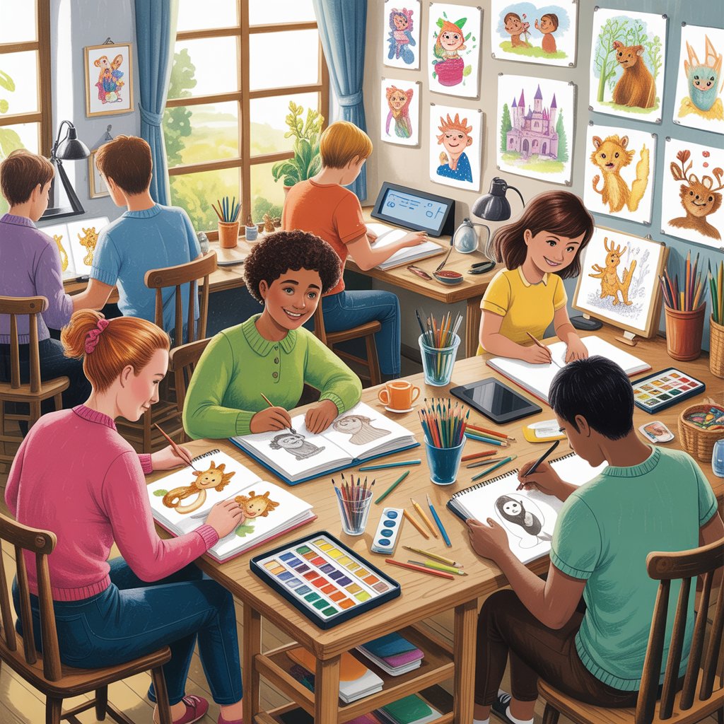
So you wrote a children’s book. Maybe it took you three weeks. Maybe it took three years. Either way, you’ve got a story sitting in a Google Doc or a Word file, and now you’re staring down the biggest question in self-publishing: who’s going to make it look like an actual book?
Finding the right KDP children’s book illustrators is where most first-time authors in the US either get it really right or really wrong — and the painful part is, you usually don’t find out which one until you’re already deep into the process.
This isn’t a fluffy “just believe in your story!” post. This is a real guide to finding someone who can take your manuscript and turn it into children’s book illustrations that hold up on Amazon, hold up in print, and actually make kids want to sit down and read the thing cover to cover.
KDP Children’s Book Illustrators: Why This Decision Matters More Than You Think
Here’s something nobody tells you when you first start researching Amazon KDP self-publishing: your story is maybe 30% of why your book sells. The other 70%? It’s the cover, the art style, and whether the “Look Inside” preview makes a parent think yes, my kid would love this in about ten seconds flat.
That’s not cynical — that’s just how picture books work on Amazon. Children’s books are a visual product first. Parents are scrolling fast. The cover is the first filter. The interior spreads are the second filter. Your words are what keeps the child coming back for a reread, but the art is what gets the book off the digital shelf.
This is why the KDP children’s book illustration decision carries so much weight. Get it right and your book can genuinely compete on Amazon. Get it wrong and even a beautiful story can sit at zero sales for months.
A studio like Drawphics sees this play out constantly. Authors who cut corners on illustration almost always come back later asking if the book can be redone. And redoing it from scratch costs more — in time, money, and sales already lost.
What Actually Separates a Good KDP Illustrator From a Bad One
Most articles stop at “find someone with a strong portfolio.” That’s true but it’s not enough.
A genuinely good Amazon KDP children’s book illustrator is doing two completely different jobs at once, and most artists are only trained for one of them.
The first job is the obvious one: drawing. Specifically, drawing children’s book characters with enough personality that a four-year-old bonds with them immediately, and drawing them the same way on page 4 as on page 22. That second part — character consistency — sounds basic, but it’s actually where a huge number of freelance illustrators fall apart. Your main character’s eyes can’t be different sizes on different pages. Their hair can’t randomly change texture. Their proportions can’t shift because the artist drew them from a different angle and eyeballed it. Kids notice this stuff even when they can’t articulate it. It just makes the book feel off.
The second job is technical, and this is where a lot of talented artists who’ve never worked in KDP publishing specifically hit a wall. Amazon KDP has real requirements. Your files need to be 300 DPI — not 72 DPI web resolution, not 150 DPI “good enough” resolution, but actual print-grade 300 DPI. Your color mode needs to be CMYK, not RGB. RGB looks great on a monitor but it prints differently. That sunset that looked warm gold on screen can come out orange-brown on paper. Your files need proper book bleed and trim size margins built in, or you end up with white borders showing around your full-bleed spreads in the physical book.
Miss any of that, and you’re either getting rejected at upload or holding a printed proof copy that looks nothing like what you approved on screen.
This is why working with a studio that handles KDP children’s book illustration specifically — rather than a general artist who figures out KDP formatting as they go — is a real difference-maker, especially for first-time authors.
Illustration Styles That Actually Work for KDP Children’s Books
Before you hire anyone, you need to land on a style. Not vaguely — specifically. “Cute” is not a style. “Colorful” is not a style. When you show up to talk to an illustrator without a clear style direction, you waste time, get generic results, and revision rounds pile up because nobody was aiming at the same target.
Here are the styles that perform well in the US children’s picture book market on Amazon, and what they’re each genuinely good for:
Watercolor Illustrations
Watercolor illustrations have a warmth to them that’s hard to fake digitally. The way colors bleed into each other at the edges, the softness in the shadows — it reads as handmade and gentle, which is exactly the feeling you want for bedtime books, nature stories, books about feelings, or anything with a nostalgic world. Parents who grew up with classic picture books often gravitate toward watercolor because it reminds them of the books they loved as kids.
One thing to know: watercolor is harder to adjust after the fact. If a scene needs to be repainted, it gets repainted. So revision rounds matter more here than with digital styles.
Digital Illustrations
Digital illustrations span an enormous range — from flat vector looks to painted textures that genuinely rival traditional media. The practical advantage for KDP-ready children’s book illustrations is significant: digital files are already high resolution and can be adjusted for color mode, size, and bleed without losing quality. If you’re planning a series and need the same characters to appear across multiple books, digital is usually the smarter technical choice because style guides and character sheets can be recreated precisely.
Whimsical Illustrations
Walk into any Barnes & Noble children’s section in the US and count how many bestsellers use this style. Big round heads, oversized expressive eyes, exaggerated gestures, color palettes that feel like candy. Whimsical illustrations signal “fun” from across a room. They’re a strong choice for ages 3 to 7, and they tend to perform well on Amazon thumbnails because the bold shapes and saturated colors read clearly even at small sizes.
Cartoon Illustrations
Cartoon illustrations are punchy and high contrast, and they’re especially good for books with a comedic beat. If your story has jokes, funny misunderstandings, or a protagonist who gets into ridiculous situations, cartoon style amplifies the humor visually. Characters in this style tend to be physically expressive — rubber-face levels of reaction — which kids absolutely love.
Hand-Drawn Illustrations
There’s a segment of the US children’s book buying market — indie bookstore shoppers, Montessori families, parents who are suspicious of anything that looks too slick — that responds really well to hand-drawn illustrations with visible texture and organic line quality. The slight imperfections read as honest and personal. It’s a harder style to execute for KDP because the files require careful scanning and cleanup to meet print specs, but when it’s done right, it creates a genuinely distinctive product.
Animal Illustrations
Not a style, exactly — more of a subject — but animal illustrations deserve their own mention because animal-character children’s books are a consistent top-seller category on Amazon. A bunny, a bear, a curious fox — animal characters sidestep a lot of the representation questions that can come up with human characters, making them appealing to a wide range of authors. The key is giving each animal a truly distinct visual personality. Generic “cute animal” art doesn’t cut it.
Educational Illustrations
If your book is an alphabet book, counting book, concept book, or anything with a preschool book illustrations angle, your art needs to serve learning clarity above aesthetics. Educational illustrations are clean, labeled, visually unambiguous. The art’s job is to reinforce comprehension, not compete with it. This style shows up a lot in early reader books and activity formats.
See finished examples in the Drawphics portfolio before you commit to a direction.
How to Actually Hire a KDP Children’s Book Illustrator — The Real Process
You’ll find plenty of advice online that says “look at portfolios and pick someone you like.” That’s not wrong, but it skips over a lot of stuff that matters.
Get Your Own Clarity First
Before you reach out to a single illustrator, answer these questions for yourself — in writing, with actual specifics:
What age group is this book targeting? There’s a real visual difference between a board book for a two-year-old and a picture book for a six-year-old. Spread complexity, character expressiveness, amount of background detail — all of that shifts based on the reader’s age.
What tone does your story carry? Cozy? Adventurous? Funny? Tender? Each of those calls for a different visual language, and an illustrator needs to understand yours before they start drawing.
Are your main characters human kids, animals, or something fantastical? Each category has its own illustration conventions.
Do you have visual references? Not to make the artist copy something — to give them a real target. “I like the color palette in this book and the character proportions in that one” is infinitely more useful than “I want it to feel magical.”
How many interior spreads are you working with? A standard 32-page children’s picture book typically needs 14 to 16 full spreads plus a cover. Know your count before you start getting quotes.
Look at Complete Books, Not Just Samples
When reviewing portfolios of potential children’s book illustrators for KDP, the most important thing you can see is a finished book — all the way through. Not a character design sheet. Not three sample spreads. Not a mood board. A complete book.
A complete book tells you whether the artist can hold visual consistency across 30+ pages, whether their background environments develop across a story, whether the character you meet on page one looks like the same character on page twenty. Individual samples can look incredible and still belong to an illustrator who cannot sustain quality across a full-length project.
At Drawphics, completed projects are front and center for exactly this reason.
Ask the Technical Questions Before You Talk Creative
Most authors ask about art style first and technical specs last, or never. Flip that order. Before you fall in love with an illustrator’s work, confirm: Do they know the KDP print requirements — DPI, CMYK, bleed, trim? Can they deliver properly formatted PDFs for both interior and cover? Have they worked with the KDP cover template before? Do they understand book interior design and gutter margin requirements for bound books?
If an illustrator gets vague or confused on these questions, that’s useful information. It doesn’t mean they’re a bad artist. It means they’re probably not the right fit for a KDP book design service project where technical delivery is part of what you’re paying for.
Nail Down Revision Policies Before Work Starts
This is where authors get burned most often. They assume revisions are unlimited because the illustrator seemed agreeable during scoping. Then they’re three pages into the book, realize the character’s skin tone isn’t what they pictured, and discover that changing pages already delivered costs extra.
Pin down revision policies explicitly — in writing. How many rounds of changes are included? At which stages can you request changes without additional cost? What happens if you need to redirect the visual style partway through?
Professional children’s book illustration services lay all of this out in a contract. If there’s no contract, that itself is a red flag.
The Technical Side: What KDP-Ready Illustrations Actually Require
This section is for every author who has ever uploaded a file to Amazon and gotten rejected, or printed a proof copy and stared at colors that looked completely wrong. Here are the specs your illustrator needs to hit without exception.
Resolution — 300 DPI minimum. Print requires it. 72 DPI is web resolution — it looks fine on your screen and terrible on paper. 150 DPI is better but still soft for full-bleed picture book spreads. 300 DPI is the floor for KDP interior illustration and cover files. No exceptions.
Color mode — CMYK for print. The RGB color model that most digital screens use contains colors that printing presses can’t physically reproduce. When an RGB file gets converted at print time, colors shift — sometimes subtly, sometimes dramatically. Blues can go more purple. Greens can go more yellow. Oranges darken. A professional Amazon KDP book cover illustrator and interior illustrator should be building in CMYK from the beginning, not converting as an afterthought at delivery.
Bleed and trim. Every full-page illustration needs to extend 0.125 inches beyond the trim line on all edges. Without it, if the physical cutting of your book pages runs even slightly imprecise — and in mass printing, it always does — you get white lines showing at the edges of your “full bleed” pages. It looks bad. It’s completely preventable if your illustrator builds bleed into the files from the start.
Cover template accuracy. Your KDP cover template dimensions — front cover, back cover, spine width — change depending on your page count, paper type, and trim size. Amazon generates a custom template for each book. Your cover needs to be built inside that exact template or the spine text will be positioned wrong and the cover can get rejected on upload.
Gutter margins in interior layout. Children’s book layout for a bound print book requires inner gutter margins wide enough that text and key image elements don’t disappear into the binding. Illustrators who only work in digital or editorial contexts sometimes miss this because their work isn’t designed to be bound and held in a hand.
All of this is standard production at Drawphics. It’s not an add-on or a special request — it’s how every KDP project gets built.
What KDP Children’s Book Illustration Services Actually Cost in 2026
Real talk on pricing, because the range you’ll find online is genuinely confusing.
At the lowest end — $15 to $30 per illustration — you’re typically looking at artists with no real experience with KDP print requirements, limited understanding of character consistency across a full book, and no accountability if the final files are unusable. The apparent savings can evaporate fast when you’re paying someone else to fix their files or reprinting a proof copy because the colors came out wrong.
Mid-range professional children’s book illustration services in the US market sit roughly in the $100 to $250 per spread range, with complete picture books landing somewhere between $2,000 and $4,500 for interior illustration. Cover design, priced separately, typically runs $300 to $800 for a properly formatted KDP cover template-ready file.
Full-service packages from studios that cover character design, interior spreads, cover design, and KDP file production together usually run between $2,500 and $6,000 for a standard 32-page book. That sounds like a lot until you add up individual service costs separately — and until you think about what your book needs to earn at KDP royalty rates to recoup the investment.
Affordable children’s book illustrators who deliver real quality do exist. But “affordable” here means fair-market competitive — not rock-bottom. Books illustrated at rock-bottom rates rarely make their money back, because they don’t sell. The illustration IS the product.
Matching Your Illustration Style to Your Reader’s Age
One of the clearest markers of an author who has done their research is knowing what visual complexity is right for their target reader. Here’s how to think through it:
Board books (ages 0–3) need the simplest possible compositions. One or two characters per spread. High contrast. Bold, clean colors. Zero visual clutter. Babies and toddlers process visual information differently than older children — they need shapes they can identify quickly. Animal illustrations and oversized, expressive faces dominate this category for real reasons.
Picture books (ages 3–8) are where full visual storytelling lives. This is the sweet spot for whimsical illustrations, watercolor illustrations, and rich background environments. The best picture books in this range have interior spreads where you can find new details on the fifth reading — a background character doing something funny, a visual callback to an earlier page, a small animal appearing throughout. That’s the depth that gets a parent to buy your next book.
Early readers (ages 6–10) use fewer illustrations per page but each one carries more narrative weight. The art needs to clarify or deepen the text, not just decorate it. Cartoon illustrations and clean digital illustrations both work well here because clarity of communication matters more than visual richness at this reading stage.
Visual Storytelling: The Thing That Makes Kids Demand a Reread
Here’s something worth thinking hard about before you finalize your illustration direction.
In a genuinely good children’s picture book, the text and the art aren’t saying the same thing on the same page. The text says one thing; the art adds something the text doesn’t. That’s visual storytelling — and it’s the difference between a picture book kids want read to them over and over and one they forget by morning.
Your text might read: “Lily couldn’t find her red boot anywhere.” The illustration, meanwhile, shows the boot sitting right there in the corner behind the dog — who is lying on it. The child reading sees this immediately. They laugh. They point at the dog. They’re now participating in the story, not just receiving it.
That kind of layered storytelling is something you should be looking for in portfolio samples. Are the backgrounds active or decorative? Do the characters’ expressions carry emotions beyond what the text states? Is there humor, irony, or foreshadowing happening visually?
An illustrator who thinks this way — who sees their job as co-author, not just visual transcription service — will make your book better in ways your manuscript alone never could.
Red Flags to Watch For When Evaluating Illustrators
Because it’s not all green lights. Here are the warning signs that something’s off:
The portfolio shows lots of individual characters and concept art but no finished, full-length books. Character sheets are a starting point. A completed 32-page project is proof of execution.
Pricing is suspiciously low with no clear explanation. Professional pricing exists for a reason. An artist charging $12 per spread is not going to spend the time a $12 spread requires.
They can’t answer basic questions about KDP technical specs — DPI, CMYK, bleed. It’s fine to specialize in art rather than production, but if they’re billing themselves as a children’s book illustrator for self-publishing, they need to at least understand why these specs matter.
No contract, or a vague verbal agreement. A real contract protects both sides. If the illustrator resists a written agreement, walk away.
They say yes to everything immediately without asking questions about your story. Good illustrators have questions. They want to understand your tone, your characters, your world before they start drawing. An artist who jumps straight to payment without asking anything about the book isn’t thinking hard enough about the creative work ahead.
How Drawphics Works With KDP Authors Across the United States
Drawphics has built its entire illustration practice around one specific kind of project: books that need to actually work. That means beautiful art that is also technically correct for print, delivered in formats that upload cleanly to Amazon KDP, with character consistency that holds up across 30 pages.
The KDP children’s book service runs from character design through final delivery. Authors don’t hand off a manuscript and disappear — there are structured approval stages, starting with character design sheets that lock in your characters’ appearances before a single spread gets illustrated. Then thumbnail sketches before finished art. Then finished spreads with revision rounds built in. Then cover production built to your exact KDP cover template dimensions. Then print-ready file delivery in the formats Amazon requires.
Beyond KDP-specific work, Drawphics offers custom children’s book illustrations for authors who want something entirely their own, character design as a standalone service for authors who need to nail a character before committing to full production, watercolor illustration for that classic storybook warmth, book cover design for print and ebook formats, and 2D illustration work across styles.
Finished projects live in the Drawphics portfolio. Common project questions are answered on the FAQ page. When you’re ready to talk about your specific book, the contact page is the right place to start.
If You’re Building a Series, These Decisions Lock In Now
If you’re planning more than one book — a series, a recurring character, a world you want to return to — the decisions you make on book one carry forward into every book that follows.
This is the author branding angle that most self-publishing guides gloss over. Your illustrations aren’t just assets for this book. They’re the foundation of how readers recognize you on Amazon. When someone loved your first book and your second shows up in their recommendations, they need to recognize it immediately — same characters, same visual world, same color sensibility.
That recognition only happens if you document your style from the beginning. Character design sheets. Color palettes. Background style guides. These aren’t bureaucratic extras — they’re the reason your fifth book feels like it belongs to the same series as your first, even if three years separate them.
Drawphics supports series development specifically. When style guides and character references are maintained across projects, every book you publish benefits from the visual brand equity you’ve already built with readers.
Your Amazon Listing Is Part of the Illustration Decision
Your illustrations don’t just live inside your book. They live on Amazon.
Your ebook cover design shows up in search results at thumbnail size — roughly the size of a postage stamp on most screens. At that size, fine detail disappears. What survives is bold composition, high contrast, and a clear focal point. If your cover is beautiful at full size but muddled at thumbnail, it won’t stop the scroll on Amazon.
Your paperback book design cover needs to work physically too — what it looks like in someone’s hands, whether the spine reads clearly if it’s shelved, whether the back cover gives a parent enough to make a purchase decision.
The “Look Inside” preview is another illustration decision. The first two or three spreads in Amazon’s preview are your sales pitch. They’re what converts a curious browser into a buyer. Your illustrator should know this and should be thinking about it when designing your opening spreads. Your strongest visual moments belong near the front.
Your book metadata — title, keywords, and description — should also reference your illustration style. If your book features whimsical illustrations of forest animals, that language belongs in your listing description. It helps Amazon surface your book to the right readers and sets accurate expectations for buyers comparing similar titles.
Hiring Checklist: 10 Things to Confirm Before You Sign Anything
Before you commit to a professional children’s book illustrator for your KDP project, run through this:
- Have you seen a complete, finished children’s book in their portfolio — not just samples or character art?
- Does character consistency hold across all pages of that finished book?
- Can they explain KDP print specs — 300 DPI, CMYK, bleed — without you having to prompt them?
- Is there a written contract with defined deliverables, revision rounds, and timelines?
- Does the contract include full IP transfer so you own the final illustrations outright?
- Did they ask real questions about your story before quoting you a price?
- Are cover design and KDP file formatting included, or scoped and priced separately?
- Do you have real client references or reviews from previous self-publishing projects?
- Does their actual style match your book’s tone — not just a generic “we do any style” pitch?
- Does your gut feel right about how they communicate? You’ll be working together for months.
Final Word: The Illustration Decision Is the Book Decision
Your manuscript is the heart of your book. Your illustrations are the face. On Amazon, readers see the face first.
KDP children’s book illustrators who genuinely understand both the creative and technical demands of self-publishing aren’t impossible to find — but they require a real search, real evaluation, and real upfront conversations about specs and expectations. The shortcuts almost always cost more in the end than they save upfront.
The US children’s book market on Amazon rewards books that look professional, feel cohesive, and give a child a reason to come back to them. That starts with one good decision about who draws your story.
If you want to talk through your book with a team that has done this specifically — for self-published children’s books, for Amazon KDP, for authors across the United States — Drawphics is the right place to start that conversation.
Frequently Asked Questions
Q1: What should I look for when hiring KDP children’s book illustrators for my first self-published book?
Check for completed book portfolios showing consistent characters throughout, confirmed KDP technical knowledge (300 DPI, CMYK), clear contracts with revision terms, and real client reviews from self-publishing authors.
Q2: How much do children’s book illustration services typically cost for a KDP picture book in 2026?
Most professional KDP picture book projects in the US run $2,000–$5,500 for full illustration plus cover design. Rock-bottom pricing usually signals missing KDP specs or poor character consistency.
Q3: What file specs do KDP children’s book illustrators need to deliver for Amazon print?
Final files need 300 DPI resolution, CMYK color mode, 0.125-inch bleed on all edges, correct trim dimensions, and press-quality PDF format matching your exact KDP cover template.
Q4: Can the same illustrator handle both the KDP interior illustration and the children’s book cover design?
Yes — and it’s the better choice. One illustrator handling both guarantees the cover and interior share the same visual language, which reads as professional and cohesive to parents browsing Amazon.
Q5: How long does a full KDP children’s book illustration project take from start to print-ready delivery?
Plan for 10 to 16 weeks for a standard 32-page picture book. That covers character design, spread illustration, cover production, revision rounds, and formatted KDP file delivery.