
Album Cover Design Trends 2026: What’s Actually Working Right Now
Streaming killed the record store browse, but it didn’t kill the album cover, it just shrank it. Your artwork used to compete for attention on a 12-inch sleeve across a shop wall. Now it competes as a 300-pixel thumbnail buried in a scroll, next to a hundred other artists doing the same thing.
Understanding album cover design trends in 2026 starts with that one shift: almost every trend below exists as a reaction to designing for a tiny, scrolling square instead of a large physical sleeve.
What Are the Current Trends in Album Covers?
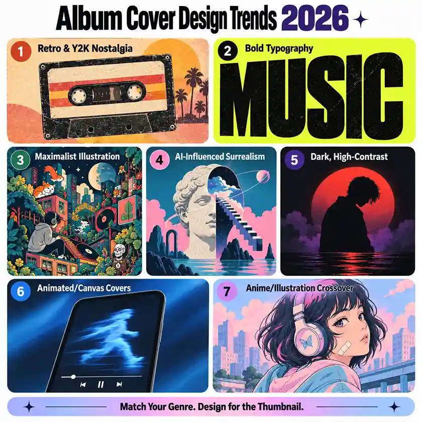
The current trends in album cover design for 2026 are retro and Y2K nostalgia, bold oversized typography, maximalist illustration, AI-influenced digital surrealism, dark high-contrast visuals, animated Canvas-style covers, and anime-influenced illustration.
Each one solves the same underlying problem in a different way: how to make a cover readable, recognizable, and attention-grabbing at thumbnail size across genres.
Here’s what each trend actually looks like and where it earns its keep.
1. Retro and Y2K Nostalgia
Film grain, VHS artifacts, cassette-tape textures, analog color degradation, and faded photo edges keep showing up across indie, lo-fi, synthwave, and pop album artwork in 2026, this remains one of the strongest and most durable album cover design trends.
Part of it is genuine nostalgia from listeners who grew up around physical media their parents owned. Part of it is a reaction against how clean and digital everything else looks, a slightly imperfect, analog-feeling album cover reads as more human in a feed full of polished renders.
Best for: indie rock, lo-fi, synthwave, soul, funk, country
Not ideal for: artists building a futuristic or cutting-edge brand, retro pulls the opposite direction
2. Bold, Oversized Typography
Raw, oversized, high-contrast type with little or no imagery is showing up heavily in experimental pop, hyperpop, and avant-garde album art, and it’s spreading into more mainstream cover design too.
The practical reason this works: at thumbnail size, one word in a huge, confident typeface reads instantly, while a detailed illustration can turn to mush at 300 pixels. Bold typography almost never does.
Best for: experimental pop, hyperpop, electronic — anywhere the cover should feel confident and stripped-down
Not ideal for: mood-driven genres like ambient or shoegaze, where type-only covers can feel cold
3. Maximalist Illustration
Working in the opposite direction from minimalist typography, highly detailed, information-dense illustration is having a real moment across pop, indie, and alternative album art, intricate linework, layered elements, small easter eggs, and rich visual worlds built to reward a listener who actually looks closely rather than just scrolls past.
This trend works precisely because it does the opposite of everything designed purely for thumbnail speed; it’s built to reward repeat viewing at full size, which matters more for physical formats, vinyl inserts, and fans who screenshot and zoom in.
Drawphics’ digital illustration techniques breakdown covers a lot of the same layered, detail-first approach that makes this style work.
Best for: pop, indie, and alternative especially artists with a strong existing fanbase who’ll actually spend time with the artwork
Not ideal for: covers that primarily need to work as a fast-scrolling thumbnail first
4. AI-Influenced Digital Surrealism
Blended photography and digitally generated elements, surreal object transformations, and color combinations that don’t occur naturally are showing up more in experimental hip-hop, alternative rap, and abstract pop album covers.
Worth being direct about this one: some AI-assisted covers look genuinely striking, and some look obviously generated in a way that reads as cheap rather than futuristic. The album artwork that actually works usually starts with real photography or real illustration and uses digital tools to push it somewhere strange, not a fully AI-generated image with no human hand involved at all.
Listeners can tell the difference, and it affects how seriously a release gets taken. This is the same tension Drawphics breaks down in AI vs. traditional animation , the tools work best paired with real creative direction, not as a replacement for it.
Best for: experimental hip-hop, alternative rap, abstract pop anything leaning into a “not quite real” concept
Not ideal for: artists who want the cover to feel handmade, personal, or tied to a specific real place or moment
5. Dark, High-Contrast Visuals
Deep shadows, desaturated tones, and a single lit subject against darkness keep dominating R&B, trap, drill, and darker alternative album artwork partly because this look holds up exceptionally well against the dark interfaces most streaming platforms use by default, and it translates well into animated Canvas loops.
Best for: R&B, trap, drill, dark pop, alternative
Not ideal for: upbeat or bright music — a moody palette forced onto happy music reads as a mismatch
6. Animated and Interactive Covers
Apple Music and Spotify (through Canvas) both support looping or animated cover art now, and several major artists have used subtly moving covers instead of static ones, a slow zoom, a flickering light, a shifting color gradient. This is less a visual style than a format shift, but it’s a real and growing part of album cover design trends in 2026.
For independent artists, this doesn’t require a full animated music video. Even a simple, well-executed loop built from a static cover concept adds an extra layer of presence on platforms that support it, without needing a full production budget. Spotify’s own Canvas guidelines are worth reading before commissioning one; the format has specific length and aspect ratio requirements (8 seconds, vertical 9:16) that affect how a static concept needs to be adapted.
Best for: any genre, budget-dependent; this is a format choice, not a genre-specific style.
Not ideal for: tight budgets, a strong static concept should come before an animated add-on, not instead of one
7. Anime and Illustration Crossover
Anime-influenced illustration and webtoon-inspired art styles have moved well past their original lo-fi hip-hop home and are now appearing in mainstream pop, R&B, and indie album cover design.
This tracks with a broader rise in illustrated, character-driven visuals across music; generally album covers, merch, and social content increasingly share one illustrated visual identity instead of a separate look for each.
Best for: pop, R&B, and indie anywhere an artist wants a consistent illustrated character or persona across covers, merch, and social
Not ideal for photographic or documentary-style genres, where illustration can feel like a mismatch
Does Album Cover Color Palette Need to Match the Music Genre?
Yes, the album cover color palette should generally match genre expectations, because a mismatch actively works against the release rather than just looking neutral. A few consistent genre-to-palette patterns worth knowing before briefing a designer:
- Dark/trap, drill: black, deep purple, blood red, neon green, cold blue
- Lo-fi, chillhop: warm pastels, soft pinks, muted yellows, anime-inspired palettes
- Retro, soul, funk: faded warm tones, film grain, worn paper texture
- Boom bap, classic hip-hop: earth tones, dark browns, muted oranges
This doesn’t mean genre convention can’t be broken, plenty of great album covers do it on purpose. But that has to be a deliberate creative choice, not an accidental mismatch.
How Do You Design an Album Cover That Still Works as a Small Thumbnail?
An album cover works as a small thumbnail when it has one clear focal point, pushes contrast further than feels necessary at full size, and gets tested at actual display size before being finalized. A few practical checks that separate covers that hold up from ones that don’t:
- Simplify the focal point. One strong subject or one bold typographic statement reads clearly at small size; five competing elements turn to noise.
- Push contrast further than feels natural at full size. Subtlety that looks appropriate on a large monitor often disappears entirely at thumbnail size.
- Test it small before finalizing. Shrink the draft down to its real display size and view it inside an actual streaming app, not in isolation.
- Check the dark-mode default. Most major platforms default to dark interfaces, a cover with a lot of light background can read as glaring or washed out. Preview it against both light and dark surroundings before locking the final version.
What Does Custom Album Cover Design Cost in 2026?
Custom album cover design in 2026 typically costs between $150 and $3,000 or more, depending on complexity, a simple typography-only cover sits at the low end, while a fully custom illustrated scene or character-driven concept sits at the high end.
| Scope | Typical Range |
| Simple typography-only cover | $150 – $400 |
| Custom illustrated cover (single subject) | $400 – $1,200 |
| Fully custom illustrated scene or character-driven concept | $1,200 – $3,000+ |
| Animated/Canvas loop version of a static cover | Add $200 – $600 |
As with any commissioned illustration work, get scope, revision rounds, and usage rights confirmed in writing before work starts.
Frequently Asked Questions
1) What size should an album cover be in 2026?
Most major streaming platforms require a minimum of 3000×3000 pixels, square format, RGB color mode. Apple Music’s official specification confirms this as the recommended minimum resolution.
2) Should I hire a professional or design my own album cover?
A DIY album cover can work for an early draft, but a professional illustrator or designer brings genre-appropriate visual language, correct file specs, and a cover that holds up at thumbnail size, details that are easy to miss designing solo.
3) Is AI-generated album art a good option in 2026?
It can work as part of a process, but fully AI-generated album covers with no human illustration or direction tend to read as generic, and listeners are getting better at spotting them.
4) Do I need an animated album cover, or is a static image enough?
A strong static album cover is still the foundation everywhere. An animated version is a worthwhile add-on for platforms that support it.
5) How long does custom album cover design usually take?
Typically one to three weeks for a fully custom illustrated album cover, depending on complexity and revision rounds.
6) What are the key design trends for 2026 more broadly? Beyond music, 2026’s wider design and art world is leaning toward similar territory, bold typography, nostalgic and Y2K-influenced visuals, and AI-assisted digital surrealism, alongside a continued appetite for maximalist, detail-rich illustration.
Whether you’re going for a bold retro illustration or a clean, character-driven concept, Drawphics’ illustration and graphic design team can help build your album’s visual identity from the cover art itself to consistent visuals across merch and social. Get in touch to talk through your project.
Looking for cover design for a book instead? See our book cover design trends guide.